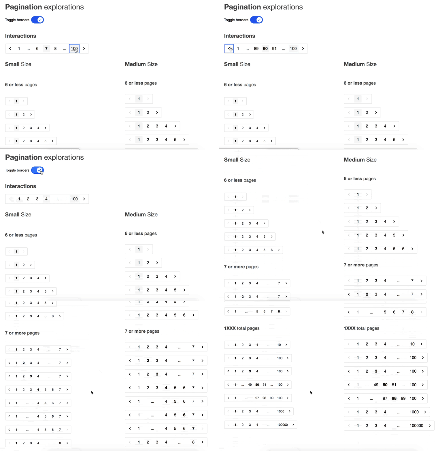
Pagination

About my work
Pagination was one of the components I contributed to Indeed's Design System. Feel free to check out my code on github.
This component demonstrates how to thoughtfully write components and how quality component architecture matters to customer needs.
For example, I included a generic <PaginationButton> component even though it's not used in the main <Pagination> component because a Japanese team said they wanted to support character-based buttons for next page and previous page, not our arrow buttons.
Most frontend devs would implement one huge tightly coupled component. Instead, I broke pagination down into reusable parts.
One big reason is that if our component was too inflexible and the Japanese team can't use it just because of one part, that Japanese team may decide to not adopt our component and either build their own, use an external one, or they may end up deciding to adopt begrudgingly and bite the bullet. A lose-lose-lose outcome all because of wrong couplings.
Breaking the component down into interchangeable and replaceable parts allows teams to adopt the parts and tailor it better to their needs. The Japanese team can now have character-based page arrows with <PaginationButton> and they don't have to rewrite an entire pagination logic.
For those who are on a design system team, you may be thinking, this component shouldn't be flexible, or we don't want people to change parts. Here are my thoughts. If a team wanted to deviate, there's a good chance that they're doing it to fit a need that wasn't fulfilled by out-of-the-box. It's really hard for one team to know all that is right. For example, you wouldn't know how some Arabic team would want to use Pagination due to some unforeseeable cultural implication. Rather than be controlling and enforcing something that may be incomplete, the design system team should let the needs of projects drive the requirements and incorporate those requirements into future iterations of the component. Get the adoption by being inclusive and let that shape the design system.
Technical details
- React - techniques used were render props, props passing with React.cloneElement, dynamic elements
- Scss
- Fully accessible
- RTL supported
- Internationalization supported
- Keyboard navigation supported
- Cross-browser supported
<Pagination> is solely responsible for layout and rendering logic of the buttons. Each pagination element (<PaginationArrow>, <PaginationPage>, <PaginationArrow>, <PaginationButton>) inherits from <PaginationSlot> which contains most of the shared logic that's also good for sweeping props passing. <PaginationEllipses> is the only one not a <PaginationSlot> because it isn't a button or link and doesn't need to have that extra <span>.
In the Japanese team's case, if they didn't want to use <PaginationArrow>, they can plug in <PaginationButton> into <Pagination> and it would still have the same functionality due to dynamic props passing from <Pagination>'s rendering logic.
If someone wanted to apply an improved rendering logic, they can create a custom pagination component (<CustomPagination>) but still use the existing pagination elements and follow Indeed theme branding. Then that implementation could be promoted to the design system if it's quality.